

I needed a real portfolio. One place to hold the absurd creature videos, the wizard shorts, the brand work for Adobe and Topaz, the Stor-AI Time series. Something I owned, not a profile on someone else's platform. I didn't want to wrestle a template or hand-code it from scratch. So I built the whole thing by talking to Claude Design.
It worked. The site is live at glennwilliams.net. But "I described a website and a website appeared" is the marketing version, and it skips the part that actually matters. Here is the real account, and what I'd tell you before you try it yourself.
Start with the brand, not the page
The first thing I built wasn't a page. It was a design system.
Claude Design lets you set one up before you ask for a single layout. I gave it the palette, the type, the voice, the rules. My twilight colors. Fraunces for headlines and Inter for body. My two mascots, Prism the iridescent demon and Fluffi the one-eyed purple alien. I fed it my actual renders so it could read the painterly retro-storybook look off real work instead of guessing at it.
That step did more than anything else I tried. Every page after it came back already on-brand. The lesson is dull but true. Give the model real context up front and it stops guessing. Skip that and you spend ten prompts dragging it back toward your taste.
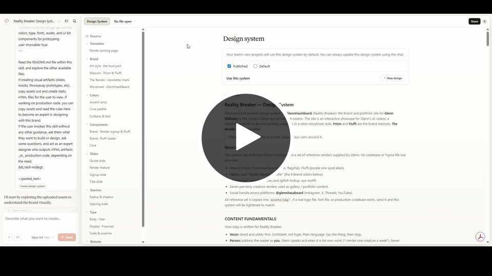
The design system came before a single page. Palette, type, voice, and the two mascots, all handed over before I asked for any layout at all.
The build was a conversation
From there I just described what I wanted, in plain language, one piece at a time.
Four pages. Home, Work, Brand Work, Contact. A video gallery with filter tabs for my series. A modal player. A social wall pulling my latest posts. A signup for The Render. The mascots doing real jobs, Fluffi blinking in the loaders, Prism hosting the social section.
The smartest decision was structural. Every video on the site reads from one file, videos.js. Add an entry there and it shows up everywhere it should, in the right gallery, under the right tab. No hunting through pages to update a thumbnail. When I finished a new piece I pasted one block and moved on.
The demo is easy. The details are the job.
Here is the part the slick AI clips never show you. The first version of anything looks great. Making it actually work is where the time goes.
My looping background clips would not loop. Native video should handle that, but the exported files fought it, so we ended up with a small watchdog that rewinds each clip the instant it stalls. My social feeds crashed the page, because the third-party widget and the page framework were both trying to own the same chunk of the screen. The YouTube embeds threw error 153 until we set the right referrer policy. New videos refused to show up because the browser kept serving a cached copy of the data file, fixed with a version stamp on the script.
None of that is a knock on the tool. The model did the heavy lifting on every one of those. But you are the one who notices the loop is stuttering and says so. The tool builds. You direct. Treat it like a fast junior who never gets tired, not a vending machine you hit once and walk away from.
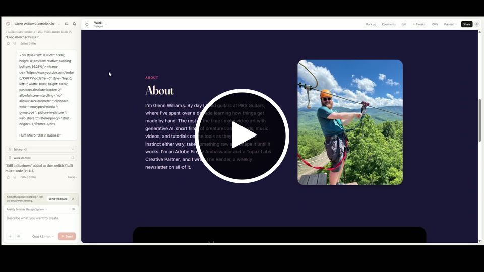
The first version always looks great. The stuttering loop, the crashing feed, the cached file that refuses to update. That is where the hours actually go.
Shipping was its own boss fight
Building the site and getting it onto the internet were two different problems, and the second one surprised me.
The first export I tried wasn't host-ready. No index file, and filenames so full of spaces they broke as web addresses. Half the pages weren't even in it. GitHub choked on a single oversized image. At one low point I merged the entire site into one file with fake tab navigation, just to squeeze it onto a host that only wanted one page. Then I worked out how to get Design to name the files correctly, and the clean multi-page version went straight up on Cloudflare. Domain and hosting in one place. Done.
Two small things cost me real time and are worth stealing. One mascot image was 9.6MB, for an avatar the size of a coin. Compressing it is what finally got the whole site under the upload limit. And when I first pasted my link anywhere, the preview showed a stray logo, because the page had no share image, so I built a proper Open Graph card. Tiny detail. It is also the first thing anyone sees when you send the link.
[SECTION IMAGE 3]
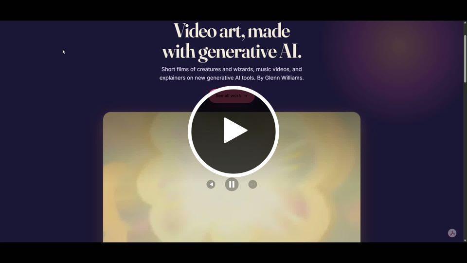
Building the site and getting it online were two different problems. The second one came with a 9.6MB avatar and filenames that broke the moment they became web addresses.
What I'd actually tell you
If you are a creator thinking about building your own site this way, here is what I learned the slow way.
Set up the design system first. It is the difference between on-brand and almost.
Drive your content from one data file. Future you will thank present you every time you add a video.
Expect to debug. The model gets you most of the way there, fast. You steer the rest, and the rest is where the site stops looking generated and starts looking like yours.
Keep your assets light. A heavy image is a slow page and a failed upload waiting to happen.
Know where you are hosting before you export, because the host decides the shape of the files you need.
I ended up with a site I own, in my own look, holding all my work, built by describing it and fixing what broke. No template, no dev. Just a few good afternoons and a lot of specific feedback. If you have been putting yours off, this is the most painless version of the job I have found.
Glenn is an Adobe Firefly Ambassador and AI creator documenting prompt engineering and creative process at @GlennHasABeard. He publishes The Render and creates the Stor-AI Time series, adapting world folktales through AI-generated video. The site from this piece is live at glennwilliams.net.